
The Global Carbon Project

The Global Carbon Project (GCP), a research consortium that seeks to quantify global greenhouse gas emissions and their causes, has published first-of-its-kind carbon dioxide research on emissions by country. This research has been used to create a couple of figures that have been snatched up and used in countless social media posts and journalistic editorials across the globe, like that of Biden’s Climate Balancing Act with China by Ben German writing for Axios.
Figure 1: Global Annual Fossil Fuel CO2 Emissions

The first thing you’ll notice about this chart is that it goes back to 2000. Its title suggests that this information is annual, not cumulative, and shows the Rest of the World, U.S., and China all increasing their carbon dioxide emissions over the duration of time. This drew a red flag because the data sets I’ve studied and know well suggest the exact opposite for the United States.
Properly plotted and annualized, the chart should instead look like this.
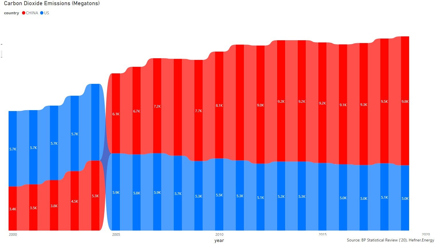
Figure 2: Shares of Historical Fossil CO2 Emissions
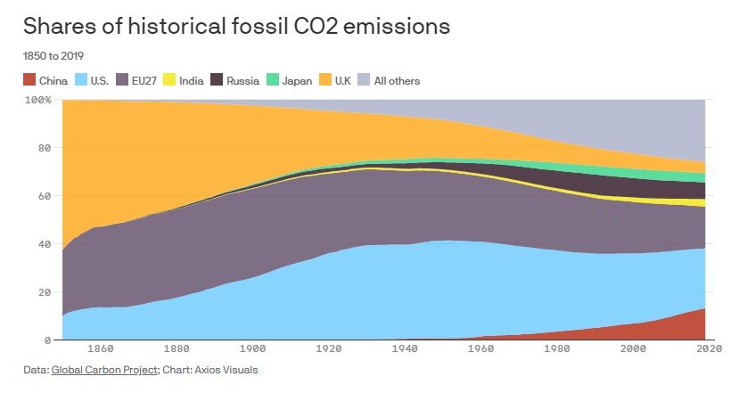
This chart seems to show that carbon emissions in the United States (the blue area) are about twice that of China (the red area). Admittedly, I failed to realize that this graph showed cumulative, rather than annualized, data over the time series. That was because the first chart had already oriented my mind accordingly. After Duncan Campell was kind enough to fix my interpretation of this figure, it still seemed off to me. The time series, which dates back to the mid-1850s, caught my attention as well as the appearance of the United States being 2x the emissions of China.
Time Series. To my knowledge, we do not have reliable carbon emissions data prior to 1965. So, where did this data come from? After investigation, I found that it relies upon four data sources:

So, the sole source for more than 200 years of data (from 1750 - 1965) is from the Carbon Dioxide Information Analysis Center (CDIAC). I’m equally unsure why the Global Carbon Project ignored the time series between 1750 and 1850, and cautions that this data set is reliable.
As the GCP study itself reads, the CDIAC is “the only data set that extends back to 1750 by country”, while speaking much more confidently about the other two - the GCP study notes that the UNFCCC data (1990-2018) is “the most detailed data and periodically reviewed” and the BP Statistical Review of World Energy data (1965-2020) is “the most up-to-date estimates of national energy statistics.” That’s not exactly a gleaming recommendation for CDIAC data. However, it’s critically important since it’s the sole data source for more than 200 years (1750-1965) by comparison to the 55 years of reliable data that we have.
The United States v. China. When comparing Figure 2 to the reliable data we have from 1965 – 2020, we find that China and the United States have emitted roughly the same amount of carbon dioxide. This is in stark contrast to Figure 2, as shown below.

It should be noted that while emissions are roughly the same during this time series, the United States emitted 4,965 megatons of carbon dioxide in 2019 by to China’s 9,826 megatons. It won’t take long for China to surpass the United States with these trendlines.
Moreover, as of mid-2019, some 236 gigawatts' worth of coal plants were being built around the world; coal and natural gas are now the fuels of choice in developing countries, where demand has skyrocketed in the past few decades. Between 2000 and 2018, China alone tripled the amount of coal power it uses. That's more capacity than in the United States, Mexico, and Canada combined!
“From 2000-2018, China alone has tripled the amount of coal power it uses. That’s more capacity than the United States, Mexico, and Canada combined! ”

Moreover, Making Things (concrete, steel, plastics) in China has also exploded their CO2 emissions. America alone produces more than 96 million tons of cement every year (one of the main ingredients of concrete and nobody knows a way to make cement without going through the process of heating limestone to achieve the desired chemical reaction - producing calcium oxide and carbon dioxide). There's no way around it. China has produced more concrete in the past 16 years than America did during the ENTIRE 20th century.
“China has produced more concrete in the past 16 years than America did during the entire 20th century.”

Quite the opposite story has played out in the United States, by contrast. The United States now emits less carbon dioxide than it did at the start of the 90s. Even Bill Gates confirms this in his new book How to Avoid a Climate Disaster. The simple fact of the matter is that the Global Carbon Project can easily deceive an untrained eye. Renewable Energy has a China Problem, too.
As Dr. Scott Tinker teaches us, “we have to be completely factual, and factually complete.” To avoid any possible confusion, I’d like to end this article with the clarification of a fact - the United States emits more per capita than China. The question facing society today is whether the one atmosphere we live in should be governed by percentages or absolute values?